

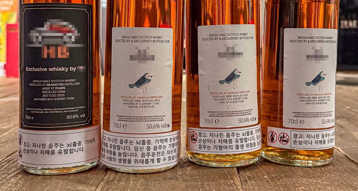
A significant shift in South Korean alcohol labeling regulations is set to take effect in November, prompting concern among whiskey importers and distributors about the potential impact on brand identity and consumer perception. The new rules mandate that crucial health warnings and graphic imagery must be prominently displayed on the front of all liquor bottles, a move that industry insiders fear could disrupt the carefully crafted aesthetics of premium spirits.
The Front Label: A Brand’s Crucial Real Estate
For many alcoholic beverages, particularly whiskey, the front label is more than just a decorative element; it’s the primary canvas for brand storytelling and recognition. This prominent position is where brands invest considerable effort to capture consumer attention and create lasting impressions. The intention behind the upcoming regulation is to enhance public awareness of the risks associated with alcohol consumption. However, the industry’s primary concern lies not with the content of the warnings themselves, but with their mandated placement.
Currently, information such as health warnings and drunk-driving advisories is typically found on the back or side of bottles. The new regulations will require these elements to be moved to the front, directly competing for space with established branding and design elements. This change is expected to affect all alcoholic beverages sold in South Korea, including imported whiskies and domestically produced spirits.
One importer described the situation with a hypothetical scenario: faced with four bottles of the same whiskey, each with a different placement and size for the warning labels, participants in a trial consistently chose the bottle that appeared least “awkward” or “intrusive.” This suggests that the visual disruption caused by the new labels could significantly influence purchasing decisions, potentially leading consumers to favor bottles that appear less visually cluttered or “damaged” by the prominent warnings.
Industry Reaction and Potential Consequences
The sentiment among industry professionals is one of apprehension. Many express that the label is an integral part of the product, akin to a brand’s signature. The meticulous design and placement of elements on a whiskey bottle are often the result of decades, if not centuries, of refinement. Brands like Johnnie Walker, for instance, maintain their iconic label design for over a century to ensure immediate recognition from afar.
The front of the bottle is where brands showcase what they most want consumers to see – be it a historical crest, artistic collaborations, or unique bottle engravings. Limited edition whiskies, in particular, often feature labels that are collectible in their own right, designed by renowned artists or featuring special collaborations. The introduction of large, intrusive warning labels on this prime real estate is seen by many as a “terror” to the visual appeal of these products.
Furthermore, the challenge extends beyond imported brands. Overseas manufacturers are unlikely to create separate label designs specifically for the South Korean market. This means that South Korean importers will likely have to resort to affixing stickers over existing labels or developing entirely new Korean-specific labels. For domestic premium spirits, which may feature intricate designs etched directly onto the bottle, adding warning labels could necessitate a complete re-evaluation of the production process.
Consumer Concerns and Market Impact
Whiskey enthusiasts are also voicing their concerns. Due to taxes and distribution costs, many spirits are already more expensive in South Korea than in their countries of origin. The prospect of further “label damage” or the need for additional sticker applications could diminish the perceived value and aesthetic appeal of purchasing these bottles domestically. Collectors, in particular, may be deterred, potentially leading them to seek purchases directly from overseas markets.
As November approaches, the landscape of whiskey retail shelves in South Korea is expected to change. While the taste of the spirits themselves will remain unaffected, the initial encounter consumers have with these beverages – through their visual presentation – is poised for a significant alteration. The debate highlights the delicate balance between public health initiatives and the preservation of brand integrity and aesthetic value in the premium spirits market.
Understanding the New Regulations
The regulatory changes, finalized by the Ministry of Health and Welfare in May, will require mandatory inclusion of drinking warnings and graphics on the front bottom portion of all liquor bottles starting November 9th. This policy aims to increase the visibility of health information for consumers. The core of the change is the relocation of these warnings from the back or side of bottles to the most visible front-facing area, where consumers first encounter the product.
While the government’s intention to raise awareness about the dangers of alcohol is generally not contested, the industry’s focus remains on the practical implications of this prominent placement. The potential for these warnings to detract from the visual appeal and brand identity is a significant point of discussion as the implementation date nears.
